In Living Color
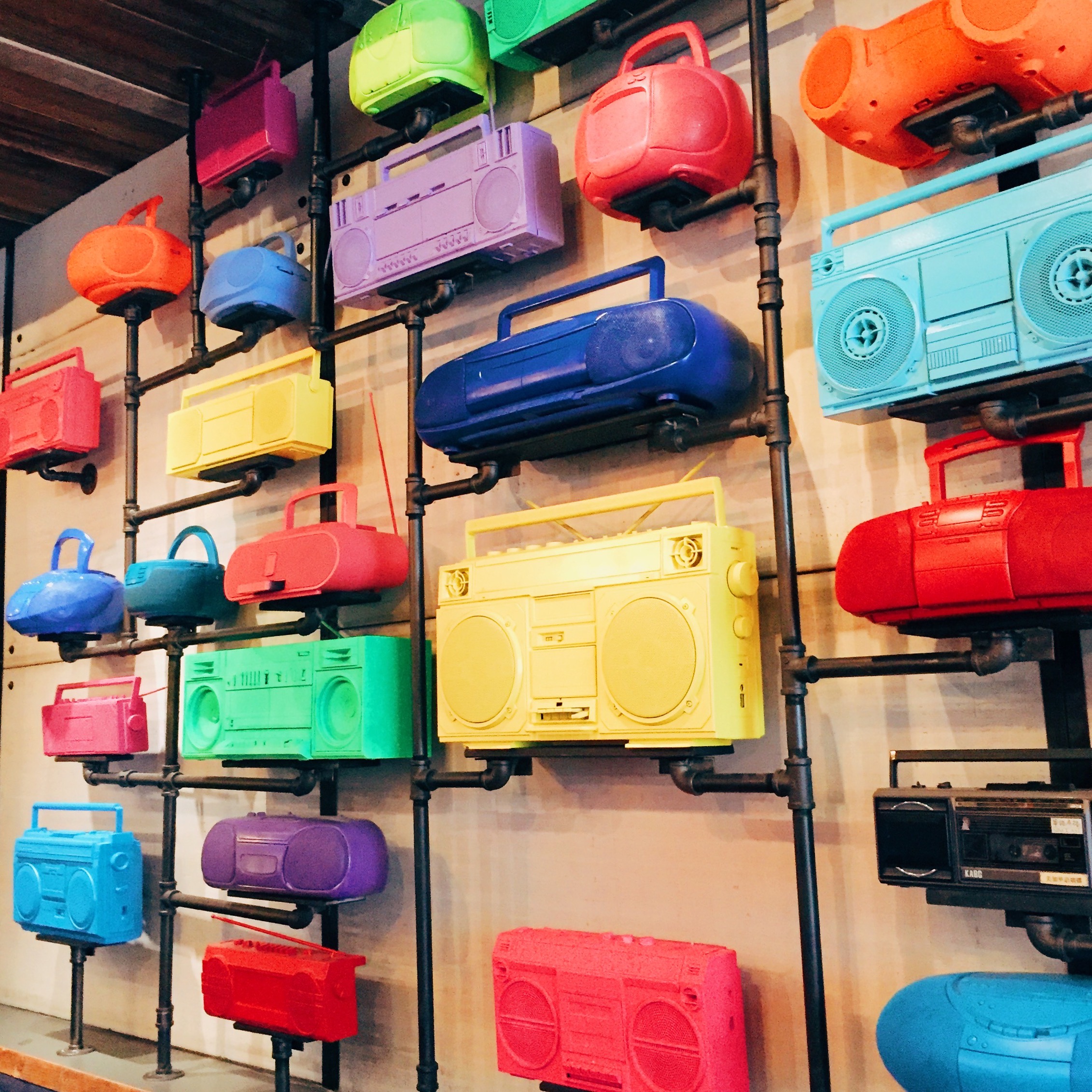
I’ve always been fascinated by color; whether with crayons as a child, or Color Theory in college. What your eyes are attracted to when it comes to color, says so much about you. Whether you realize it or not, color is a driving force in everyday life.
In the social media landscape, color is getting all the attention these days! Instagram accounts like @brightbazzar or @andrewkuttler (two of my personal favorites) showcase bright hues while racking up hundreds of thousands of likes and followers. Now why is that? I think it speaks to people’s innate emotional attachment to color! We see yellow, we’re excited; we see blue, we feel calm; we see pink….we must be a millennial. What it really boils down to is, color is a pretty simple concept. Bright colors make us happy. They remind us of that childhood crayon box or playing a game of Candyland
Living in a city like Chicago, surrounded by skyscrapers and chilly gray skies most of the year, a colorful Instagram is a great escape. The biggest compliment I can ever receive is “I love all the colors,” when someone talks about my feed. It’s about creating a story, and letting the colors do all the talking. An Instagram feed is an ever-changing canvas, one that we’re always adding to, and it’s fun to watch as seasons and times of my life change, the colors do too. In fall, it’s orange and by spring, I’ve found a way to get to pastels. The fun and challenge is capturing all those photos in between to get from one side of the color wheel to the other.
Color isn’t just having a moment in social media; it’s always played a major role in design too. Think about how colorful trinkets on the shelves of Target have always found their way into your cart or how Katy Perry oversaturated us with fruit and cotton candy at the beginning of her career. The law of the land these days is the brighter the better! We’re drawn to color because it’s not just making us happy; it makes us feel like we’re having fun! In a world that can sometimes feel strapped to the gray scale, we’re all just craving a little color in our lives.
You might be thinking that finding all these colorful opportunities isn’t easy, and you’d be right. I often find myself stumped when looking for the next shot. So what’s an instagrammer to do? Here are some tips to start incorporating the color you want both in photography and your everyday design.
1. Get inspired: I’ve always loved the challenge of keeping my Instagram (and life) vibrant, but this past year, I was craving color more than ever. A trip to the Caribbean, full of pastel houses, candy-colored cocktails, and bright blue oceans, was just what I needed. Not only was it fun to capture color through my lens, my skin wasn’t complaining either. Friends were receptive to my photos and now, I try to find color wherever I go because it can lead to inspiration for spaces in my apartment, or the theme for my next party.
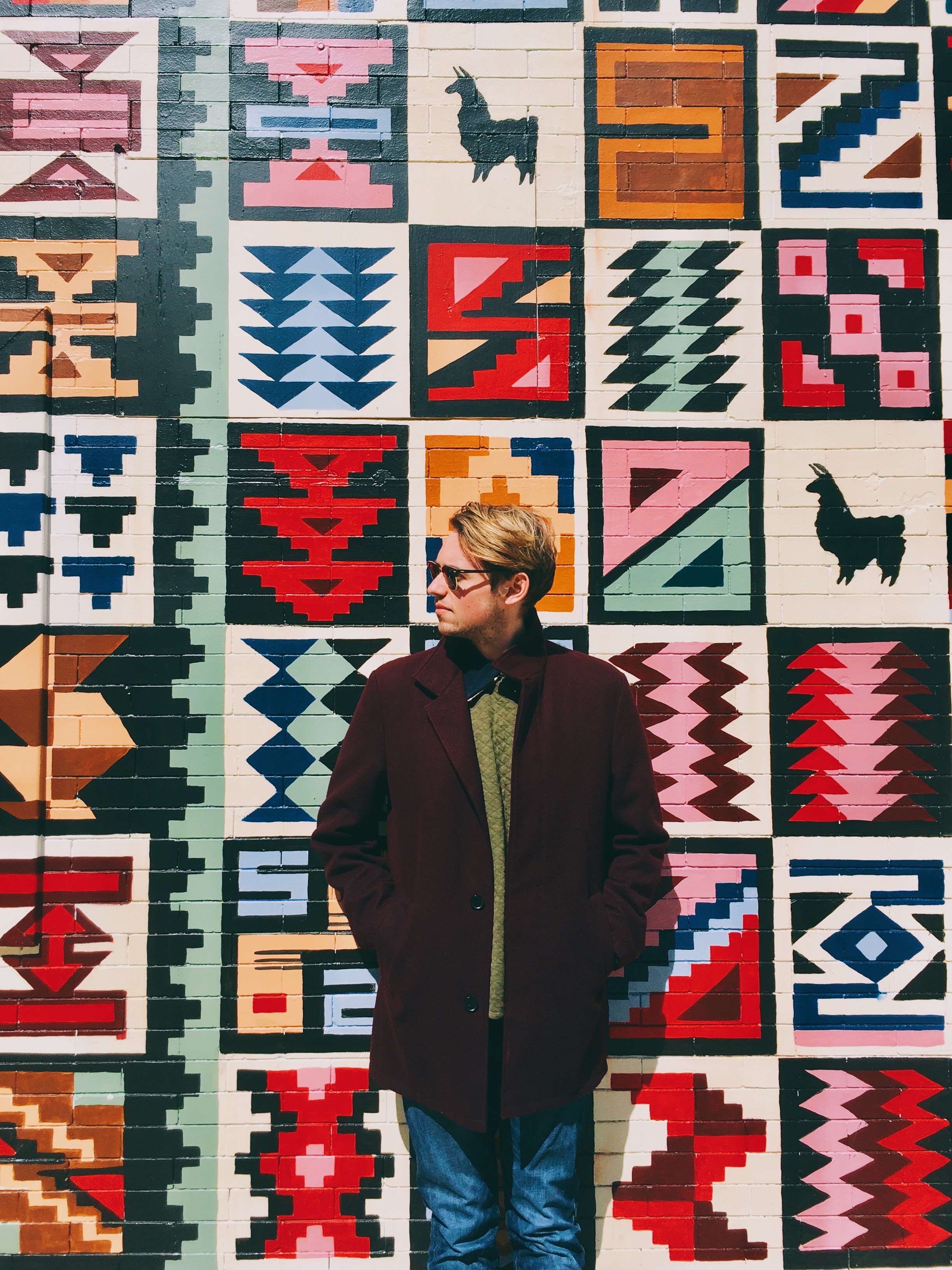
2. Keep your eyes open: Color is everywhere, even in the most unsuspected of places. Little boutiques, faded murals around town, and street markets are just a few places I find color. Get out and be on the lookout, it’s out there waiting for you. You never know what a random quick snapshot could turn into.
3. Trust your instincts: Self-doubt is not your friend, especially in art. If you love the photo or piece, stick to it! The best thing about artistry and photography is that everyone has a unique point of view. No two shots are the same so share what you love.
4. Keep it cohesive: This is probably the hardest part! It takes a lot of patience to keep it all looking unified and colorful. I follow a (self-made) formula. One color should be dominant, with two to three secondary colors. The next photo will take one of the first photo’s secondary colors, and make it the primary. The cycle continues until you’ve phased out the original primary color.
Personal example: My most recent travels took me to the Bahamas. I started off with a photo showcasing a white, yellow, and blue shirt. As the trip went on, I found a great salmon pink color and soft green to showcase. By the trip’s end, I figured out a way to highlight a little bit of each color and keep my feed uniform.
It’s safe to say that color is everywhere; you just have to look for it! The best thing about color: its purpose is to illustrate life beautifully, in design more than anywhere else. It’s almost like the saying “wake up and smell the roses.” Color is out there for you to discover and enjoy!
Contributor
TW Baker
TW Baker lives in Chicago where he works in social media. He is originally from the East Coast and came to Chicago to study advertising and art. He loves fashion, photography, traveling, and all things pop culture.


